Excel: Door Dash Sales
This data set is from a Brazilian company called iFood, a food delivery service company. Since many more people are familiar with DoorDash than iFood I will use DoorDash to refer to this data set and project. Original data set can be found here.
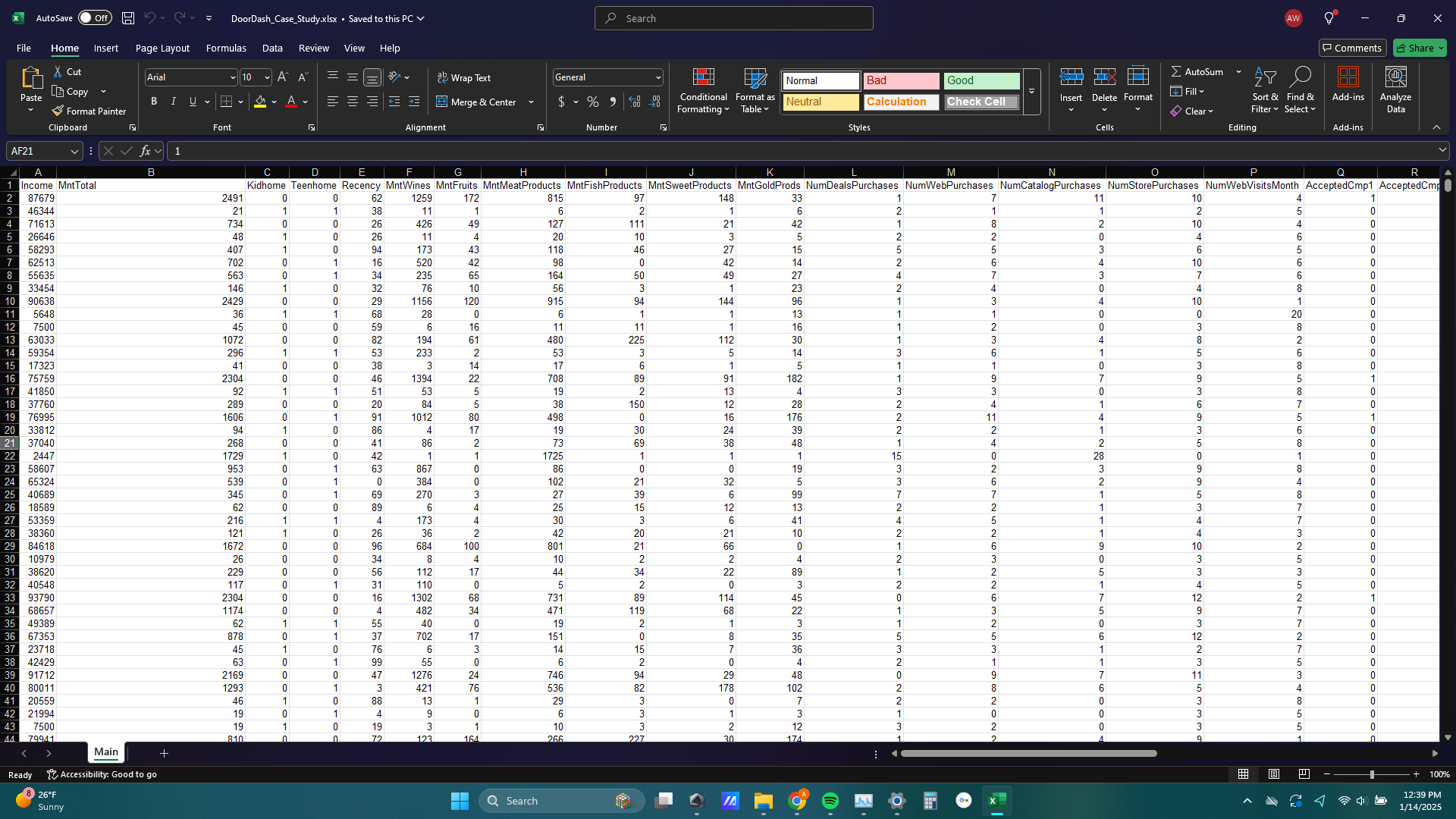
1) I started my analysis by taking some time to understand the table. Each row of the data set is a unique customer and each column is an attribute of that customer such as annual salary, how many kids live at home, and the age group of the customer.
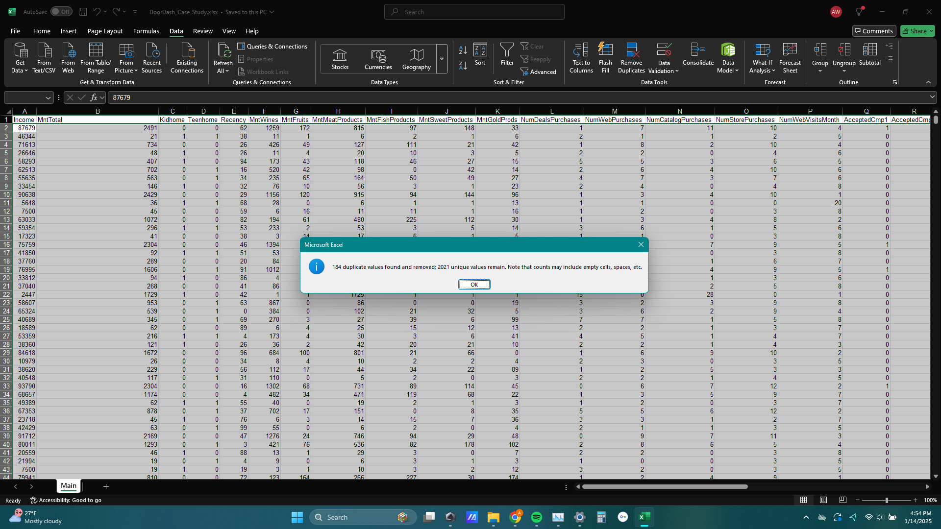
2) After taking some time to explore the columns, I used the remove duplicates tool in the data section of excel to delete any duplicate rows. I think deleting duplicate rows is smart for this analysis because the odds that two unique customers bought the exact same amount of wine, fruit, meat products, fish products, sweet products, ect is extremely low so any rows that are identical to each other are likely the result of some kind of transaction error during checkout.
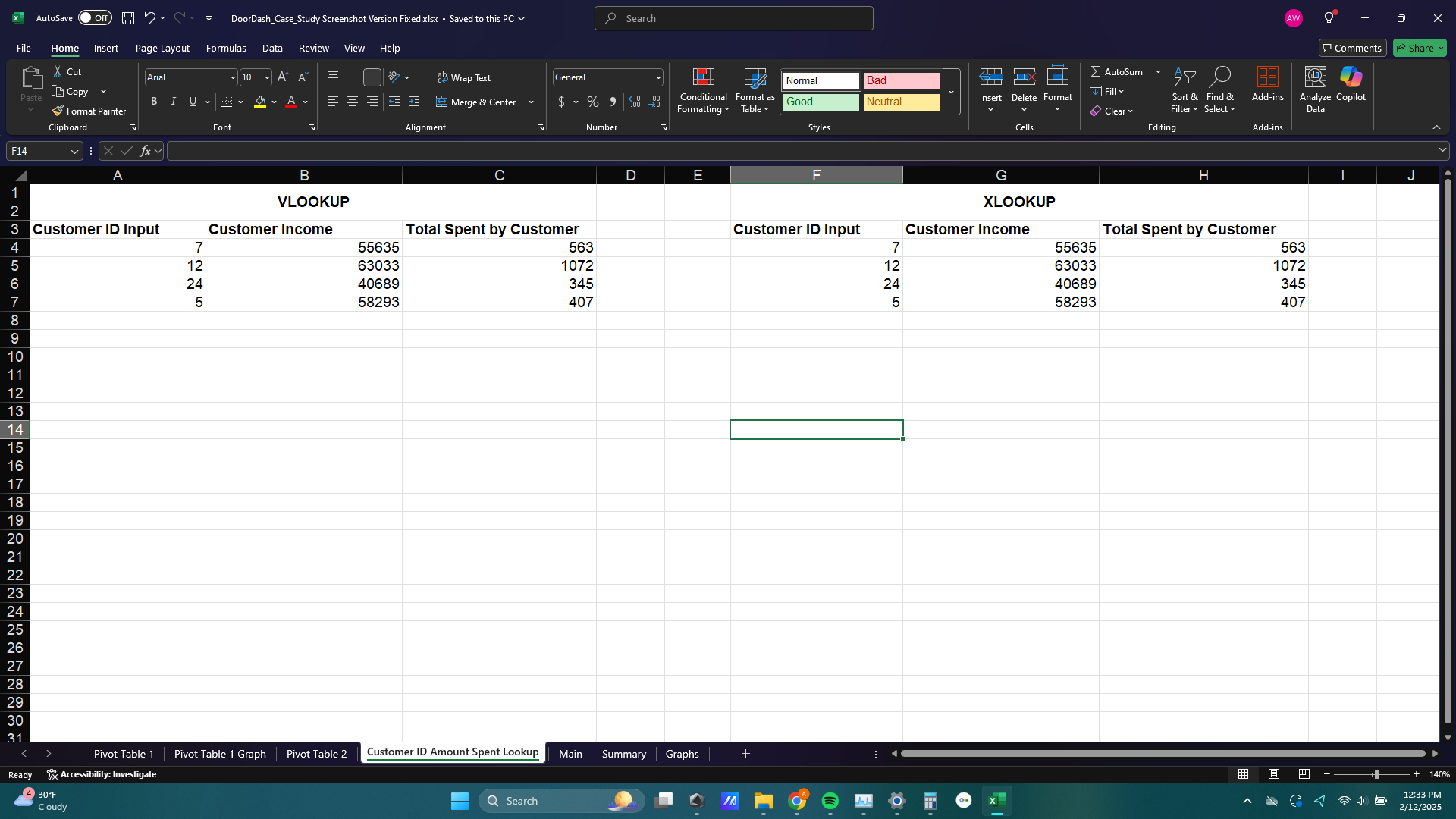
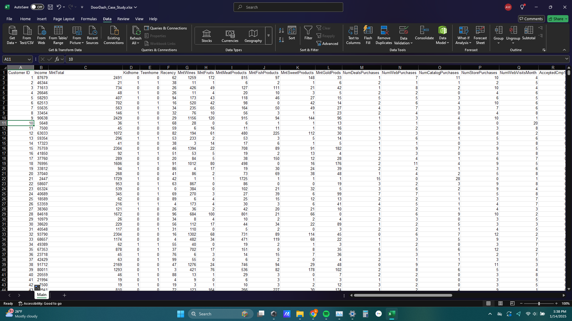
3) Since the data set does not include names of customers or any other identifiable trait, I created a Customer ID column to identify different customers which will be useful for pivot tables, VLOOKUP, and XLOOKUP.
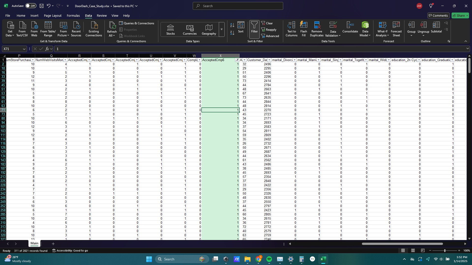
4) For this analysis I wanted to focus on the effectiveness of the “Campaign 6” advertising campaign. You can see I’ve highlighted the AcceptedCamp6 column to show all customers who responded to the campaign.
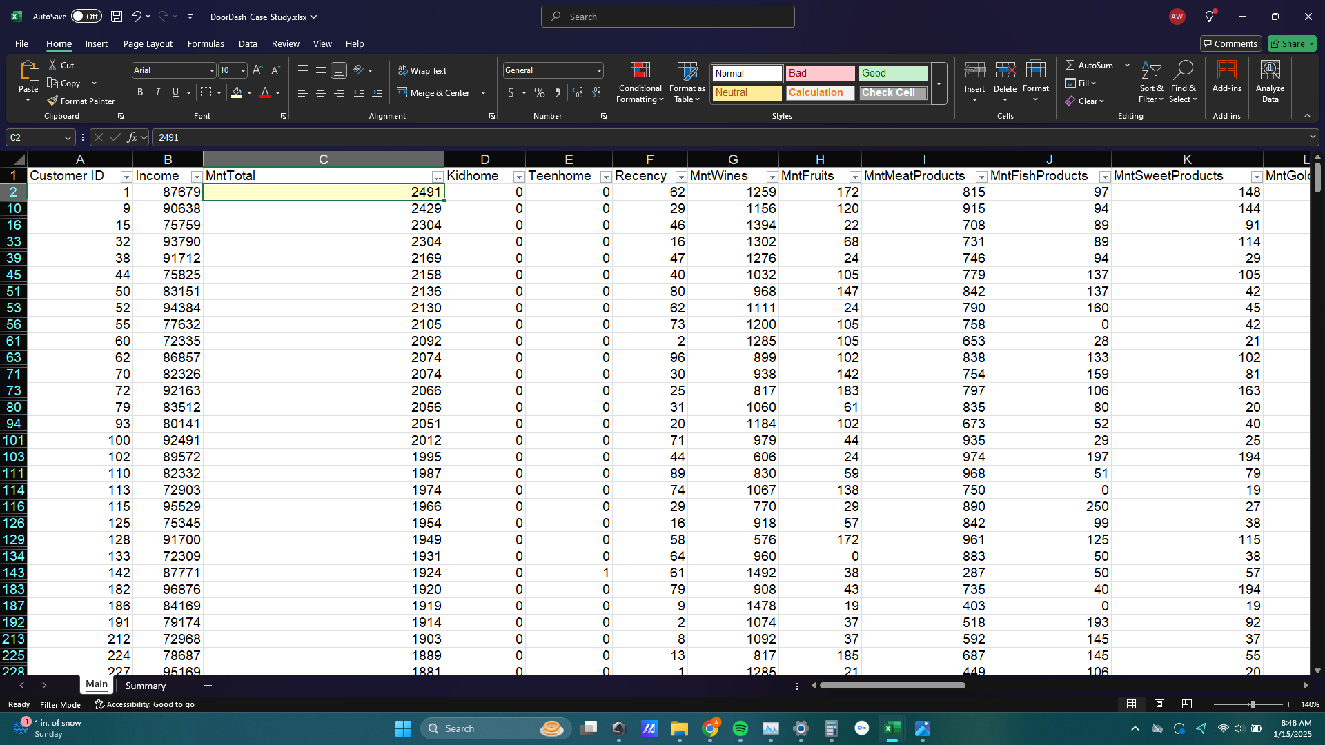
5) Then I sorted the MntTotal column in desc order to show the largest amount spent on DoorDash orders from customers that responded to advertising campaign 6, which is $2491.
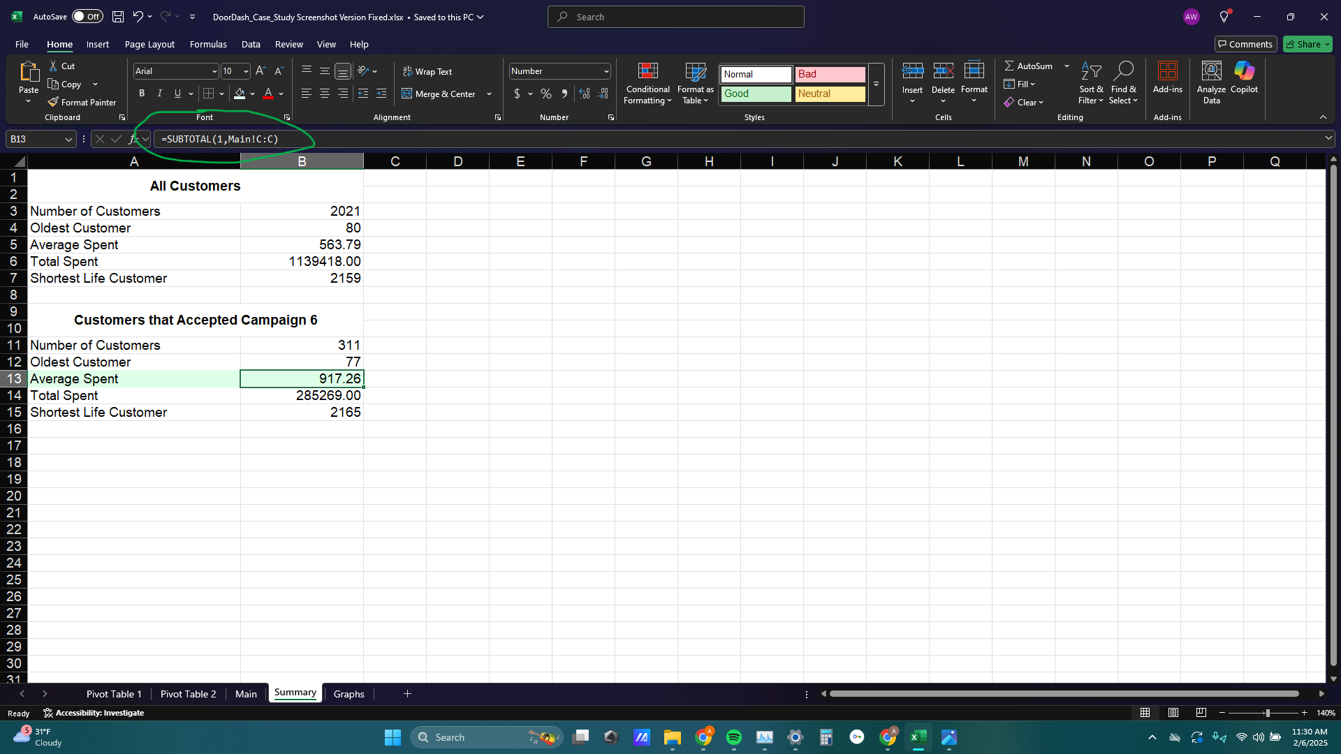
6) Next I wanted to illustrate the differences between all customers and those customers that responded to Campaign 6. I created a new sheet titled Summary and applied aggregate functions to the unfiltered data (All Customers) as well as the filtered data (Customers that accepted Campaign 6).
As you can see from the image below I used the SUBTOTAL function to aggregate only the filtered data, since the regular aggregate functions ignore filters. I noticed that the average amount spent for customers who accepted Campaign 6 was significantly higher than all customers, which I thought was interesting.
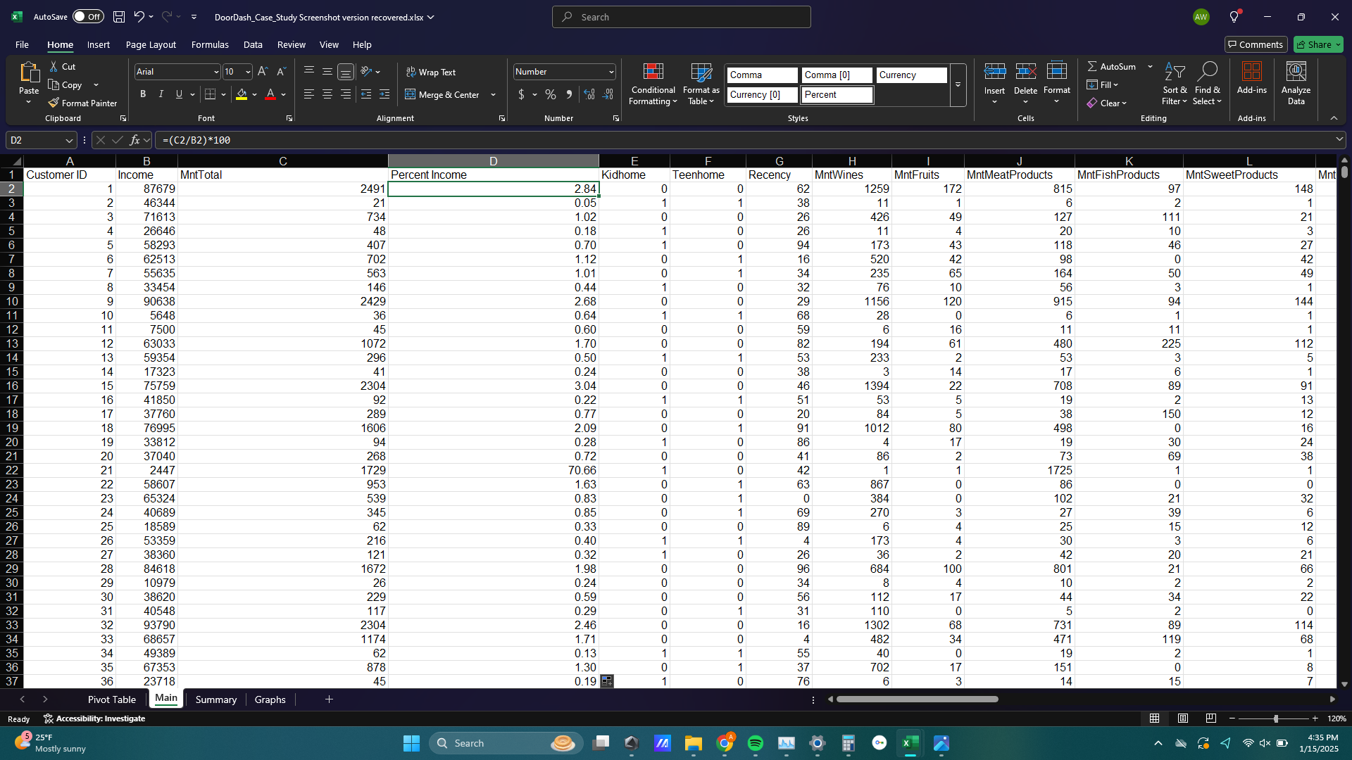
7) Then I added a new Percent Income column to show the percentage of each customer’s annual income that was used on DoorDash orders. Obviously the most valuable or successful customer, from the perspective of DoorDash, would be those with high incomes and also high percent of income spent on DoorDash orders.
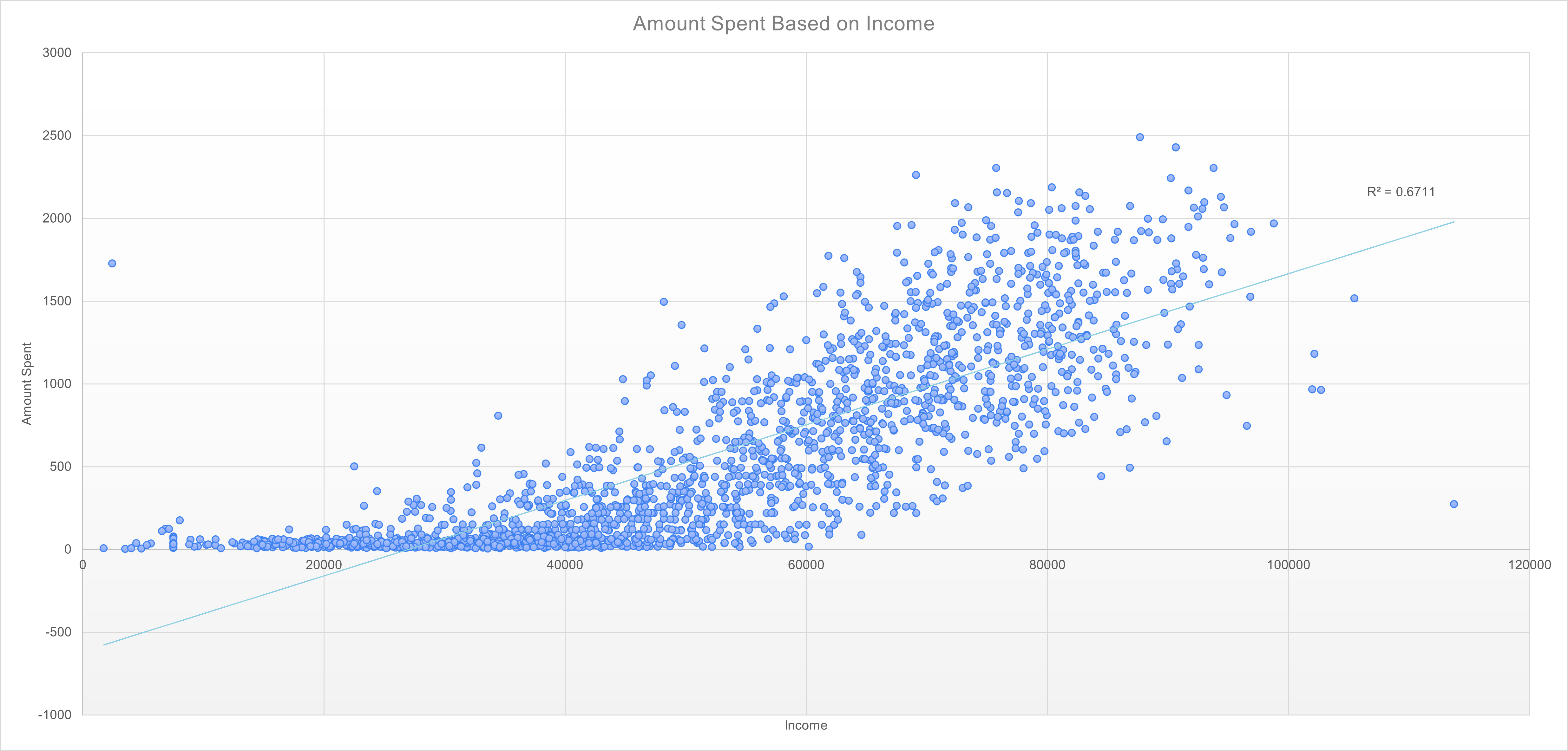
8) I wanted to visualize the performance of Campaign 6 and compare that to all customers. I did this by first creating a scatter plot of the annual income of customers by the total amount customers have spent. You can see the trendline shows that, unsurprisingly, the higher a customer’s annual income, the more they spend on DoorDash orders.
Next to the trendline is the R2 value. This number essentially means that 67% of the variance in amount spent is due to the annual income of a customer.
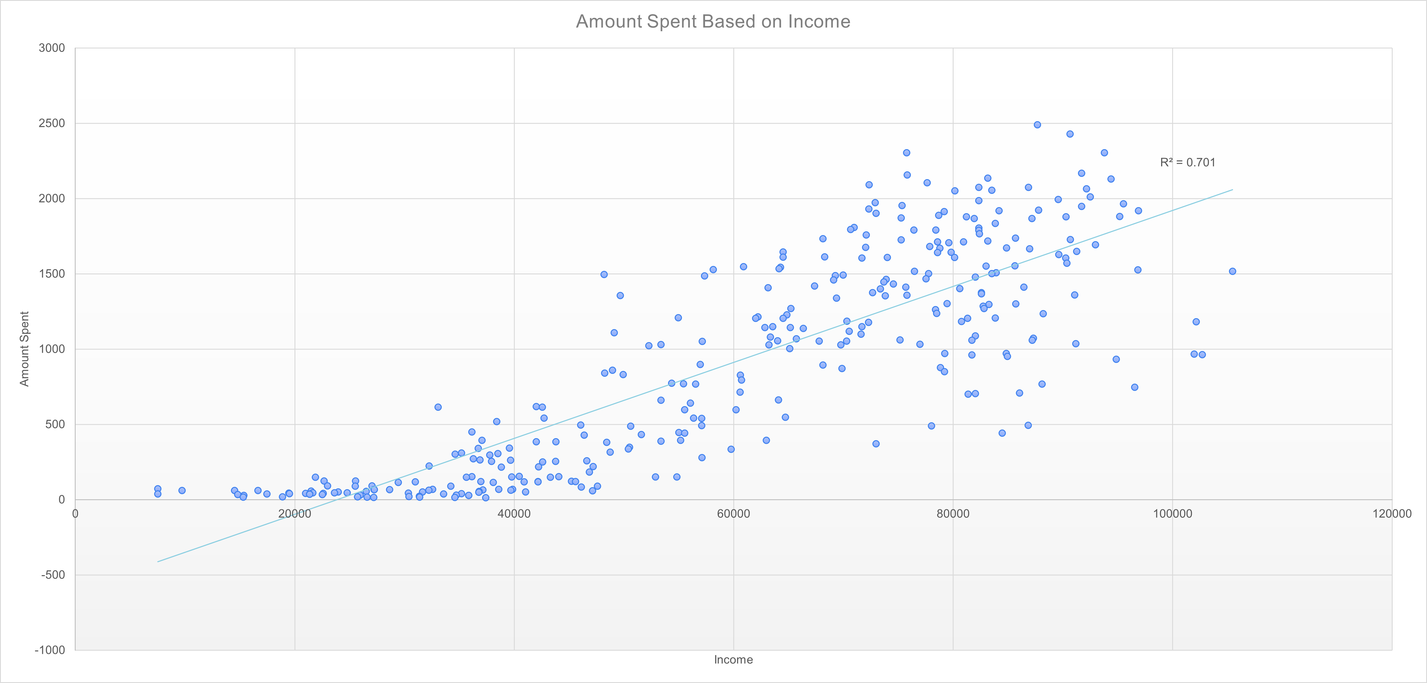
9) And here is the same scatter plot filtered for only customers who accepted Campaign 6. You can see the relationship between annual income of customers and total amount spent at DoorDash is stronger in customers who responded to campaign 6 compared to all customers.
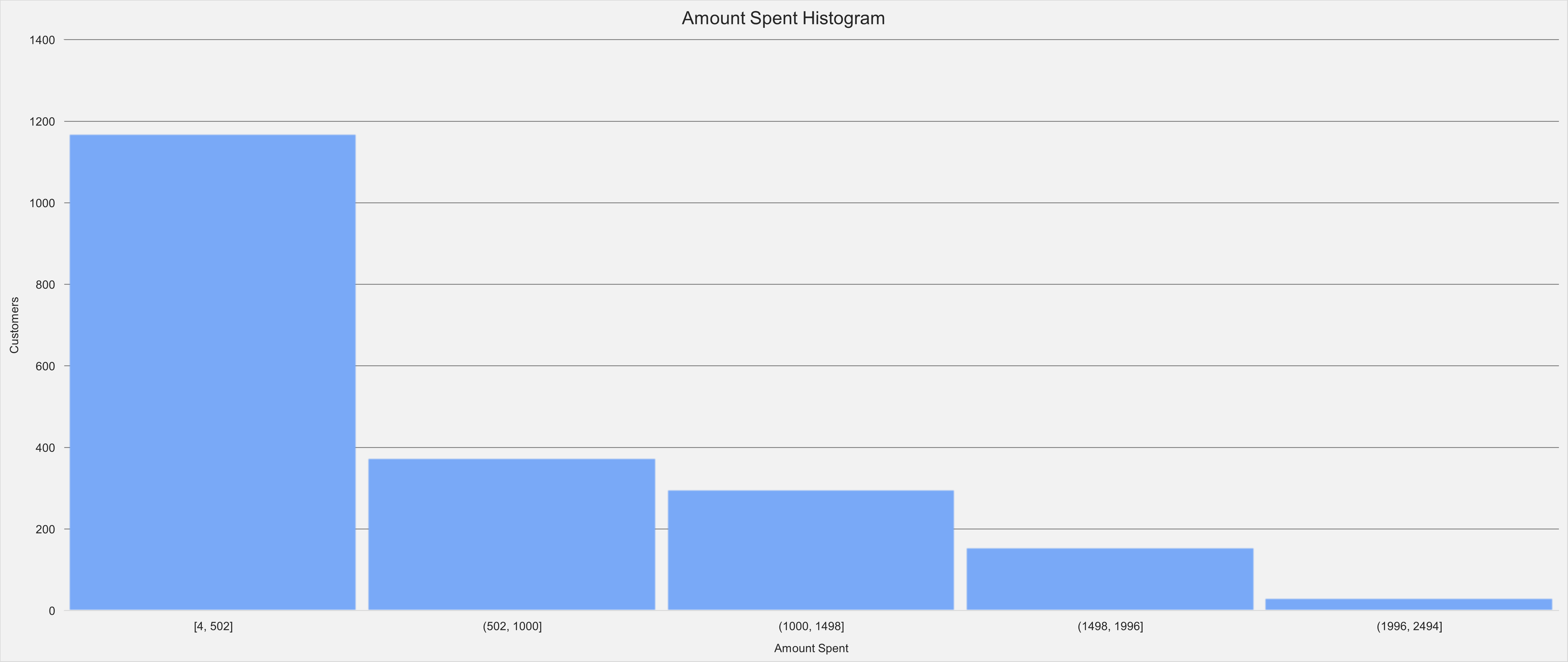
10) The next visualization I made was a histogram of the total amount spent column, which represents the total amount of money a customer has spent at DoorDash since they have been a customer. This histogram separates the total amount spent column into 5 equal categories, then counts the number of customers that fall into each category.
In the histogram below, which shows all customers, the first bar represents the number of customers that spent between $4 – $502, the second bar represents the number of customers that spent between $502 – $1000, ect.
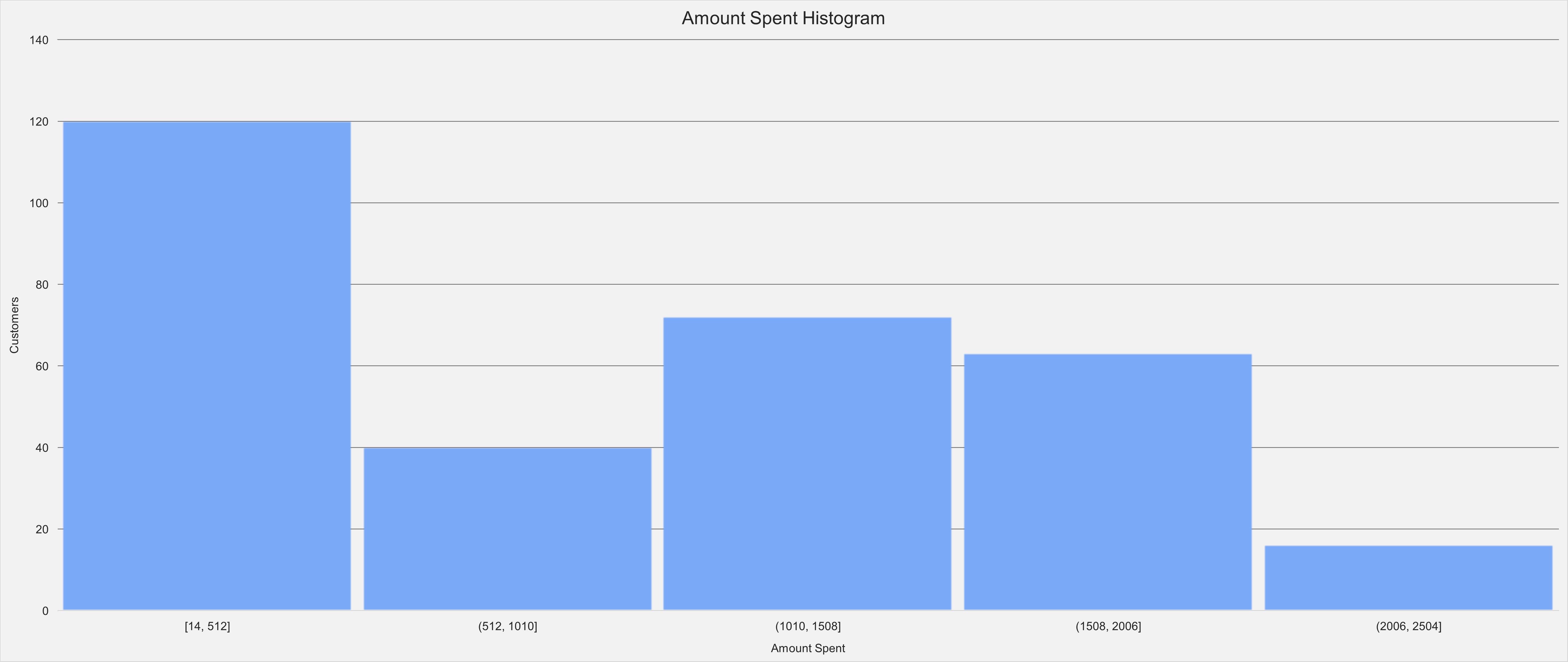
11) And here is the same histogram filtered to only include customers who accepted Campaign 6. As you can see, customers who responded to campaign 6 are more likely to spend more money.
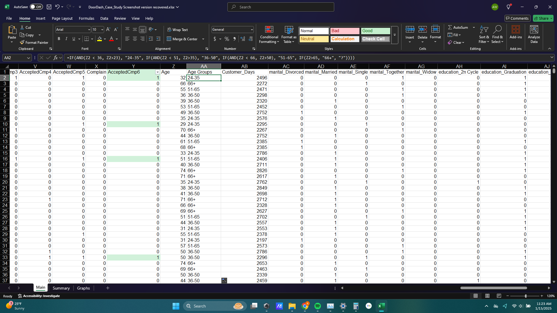
12) I also wanted to explore how age factors into the purchasing behavior of customers so I created a new column next to the Age column called Age Groups. I populated this new column with a very long IF statement placing all customers into one of 4 age groups: 24-35, 36-50, 51-65, and 66+.
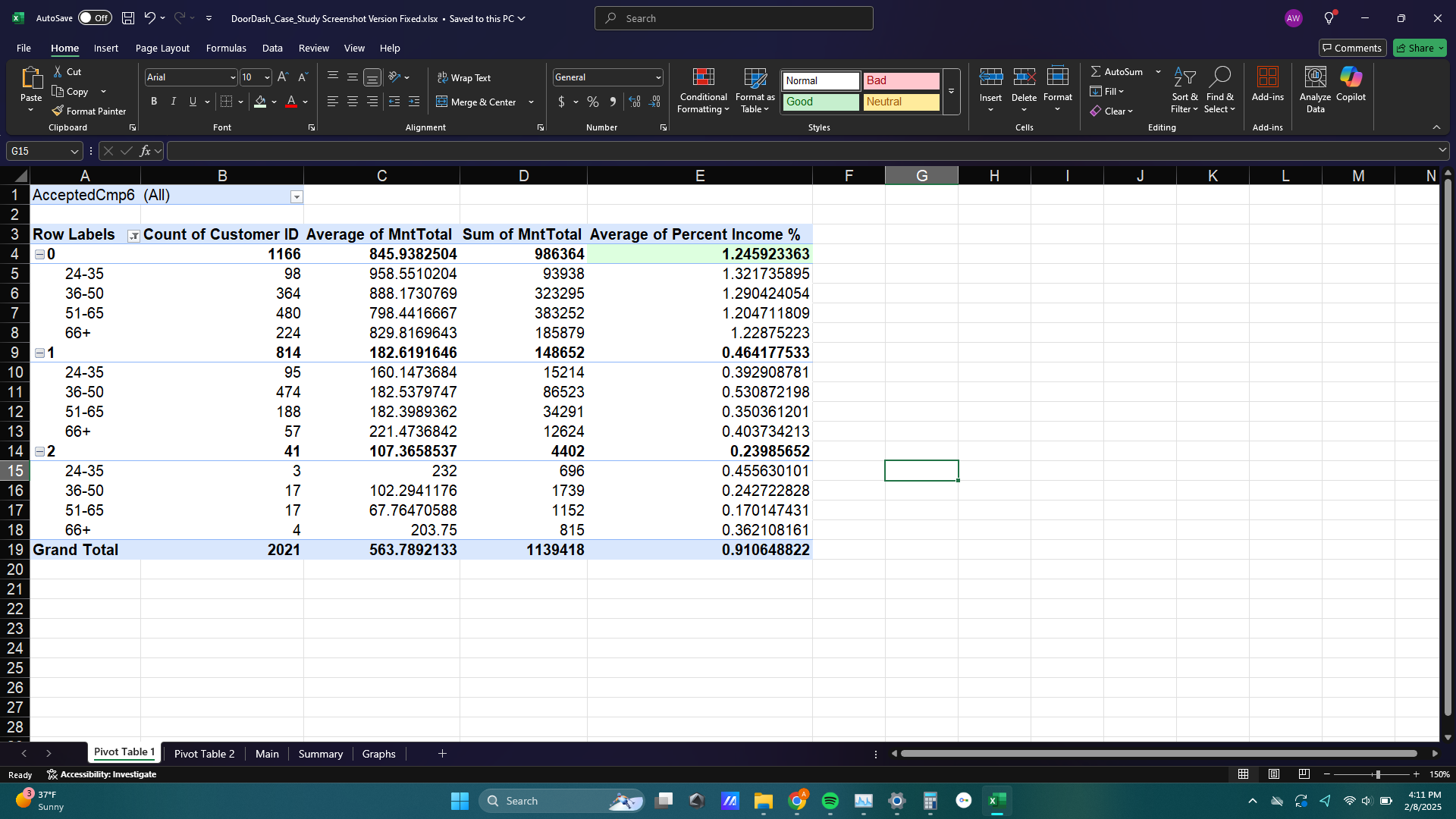
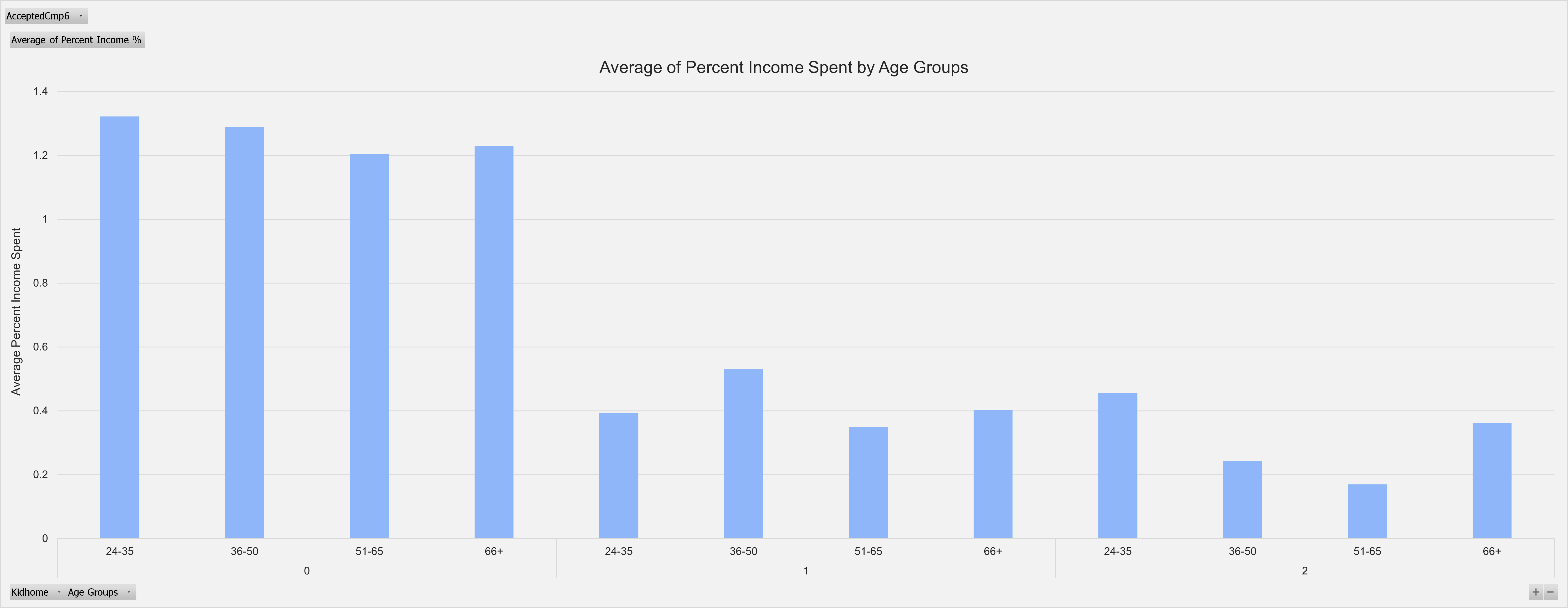
13) To show the effect of age on purchasing behavior I made a pivot table. The rows of my pivot table were broken up into the 4 age groups of customers and the number of kids that live at home from the Kidhome column (either 0, 1, or 2 kids at home).
I thought it would be helpful to include the number of kids that live at home in this pivot table because I imagined a busy family with parents late 30s early 40s would spend significantly more at DoorDash than other demographics. The columns of my pivot table were the number of customers, the sum of total amount spent, the average of total amount spent, and the average percent of income spent on DoorDash orders.
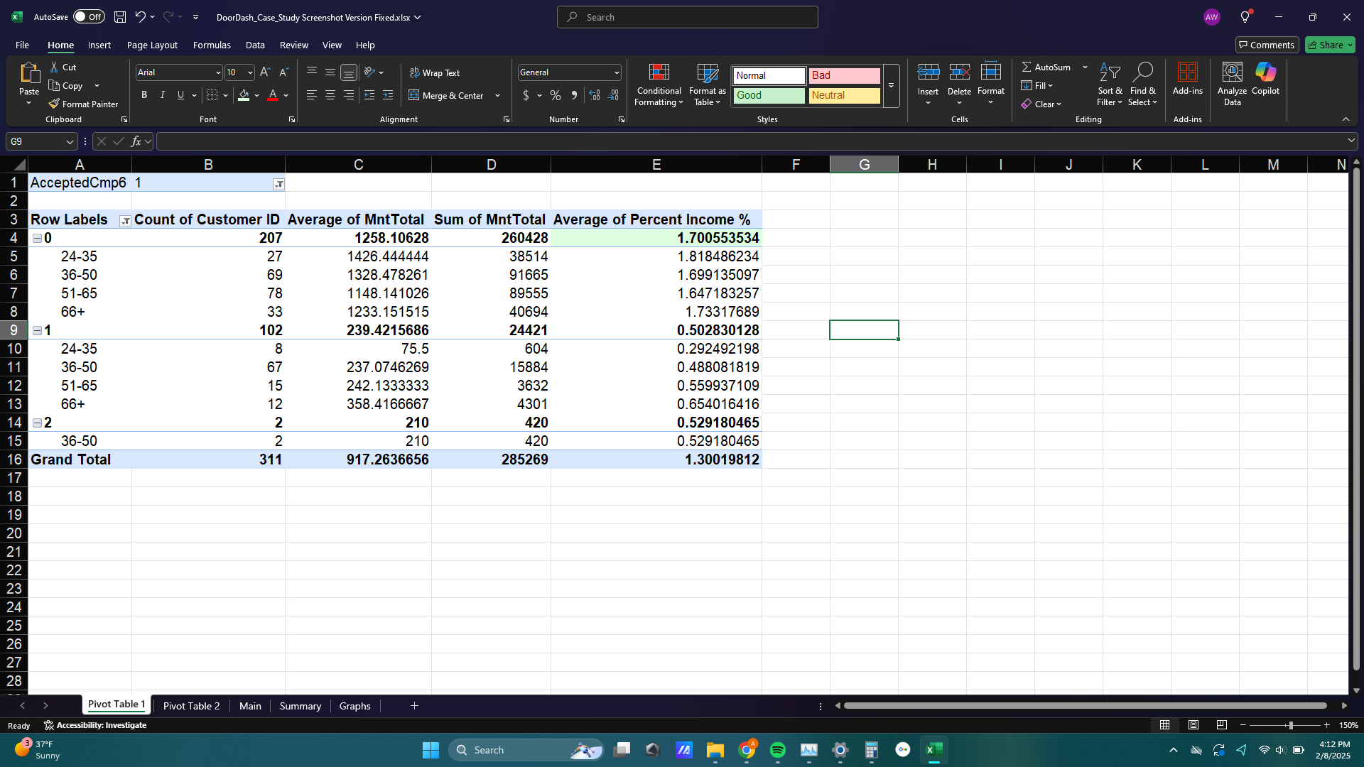
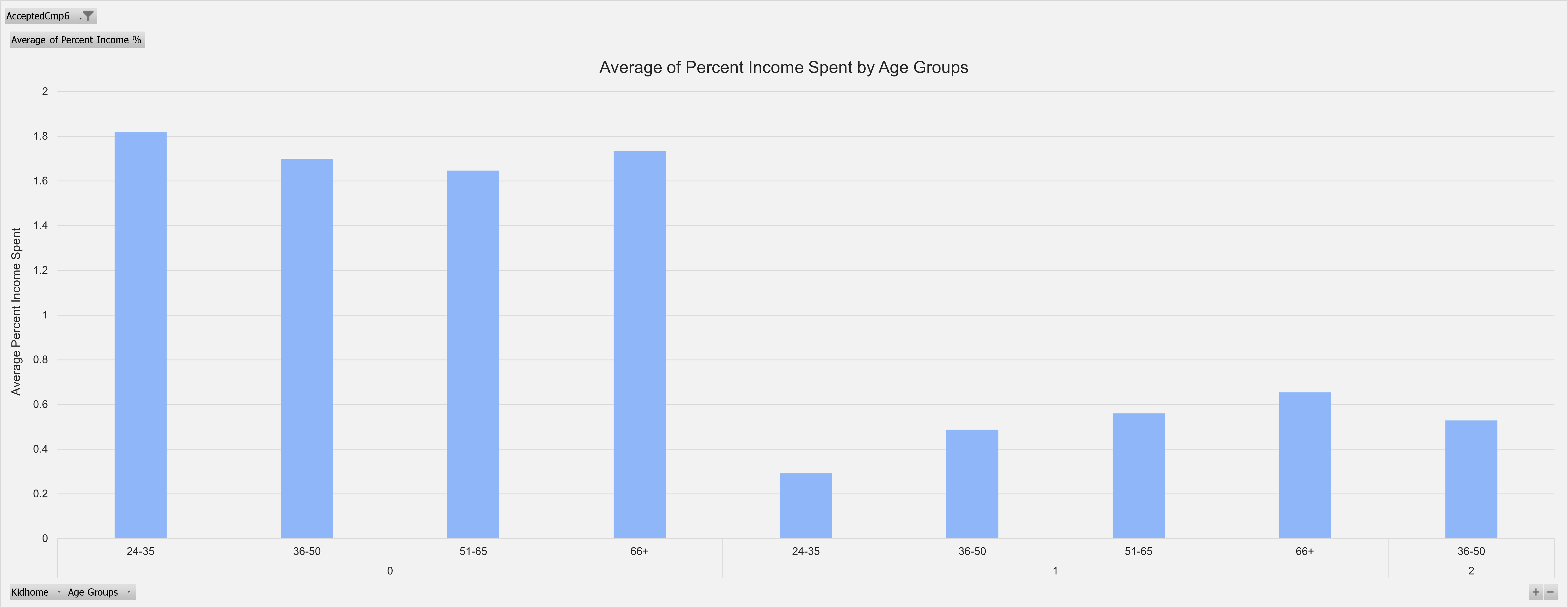
14) And to keep with the theme of this analysis so far, below is the same pivot table filtered to only include customers that responded to campaign 6. The average of percent income jumped from about 0.24% to about 0.53%, but this doesn’t tell us very much because the sample size for customers who responded to campaign 6 and have 2 kids is only 2 customers. The average percent income for customers who accepted campaign 6, 0.5%, was not significantly different from the average percent income of all customers with 1 kid at home, 0.46%.
15) The difference between all customers and customers who responded to campaign 6 are more apparent in those customers with no children at home. Customers with no kids at home spent about 1.25% of their income on DoorDash orders while customers with no kids who responded to campaign 6 spent about 1.7% of their income on DoorDash orders, a 36% increase.
The difference in percent income spent on DoorDash is even greater when comparing all customers to customers with no kids who responded to campaign 6. The average percent income spent for all customers was 0.91%, making the 1.7% of income spent by customers with no kids who responded to campaign 6 a whopping 86% increase.
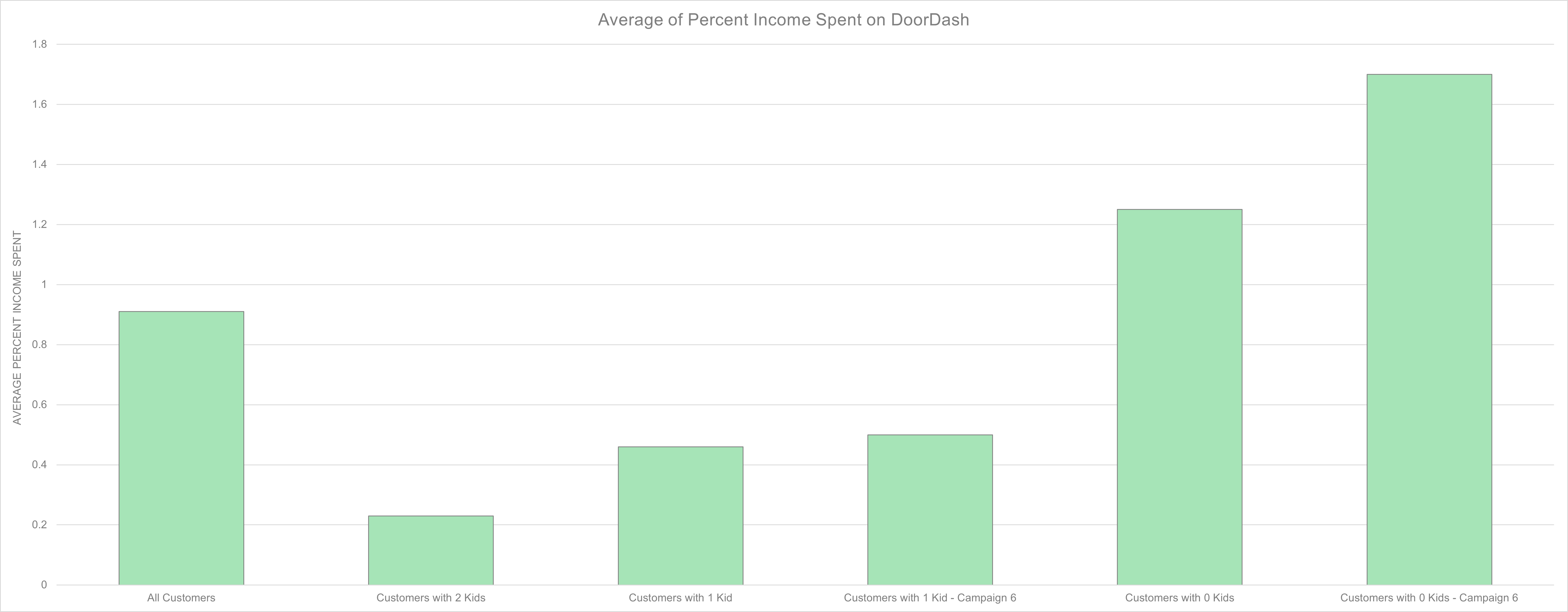
16) Seeing customers with no kids at home spend more of their income on DoorDash than customers with 1 kid at home was a surprise to me as I expected parents would be busy enough that spending the money for food delivery to save time would be worth it for them. Instead, campaign 6 was an effective marketing campaign to customers with no kids, and if future marketing campaigns could target other demographics as effectively, DoorDash could see a significant increase in revenue.
Age group, however, does not seem to have a strong effect on average percent of income spent at DoorDash. Note: the version of this graph showing customers who responded to campaign 6 only shows one age group for customers who have 2 kids at home. This is because only 2 customers with 2 kids at home responded to campaign 6. More data may shed light on how age interacts with customer spending but according to this data set customer age is not a significant factor.
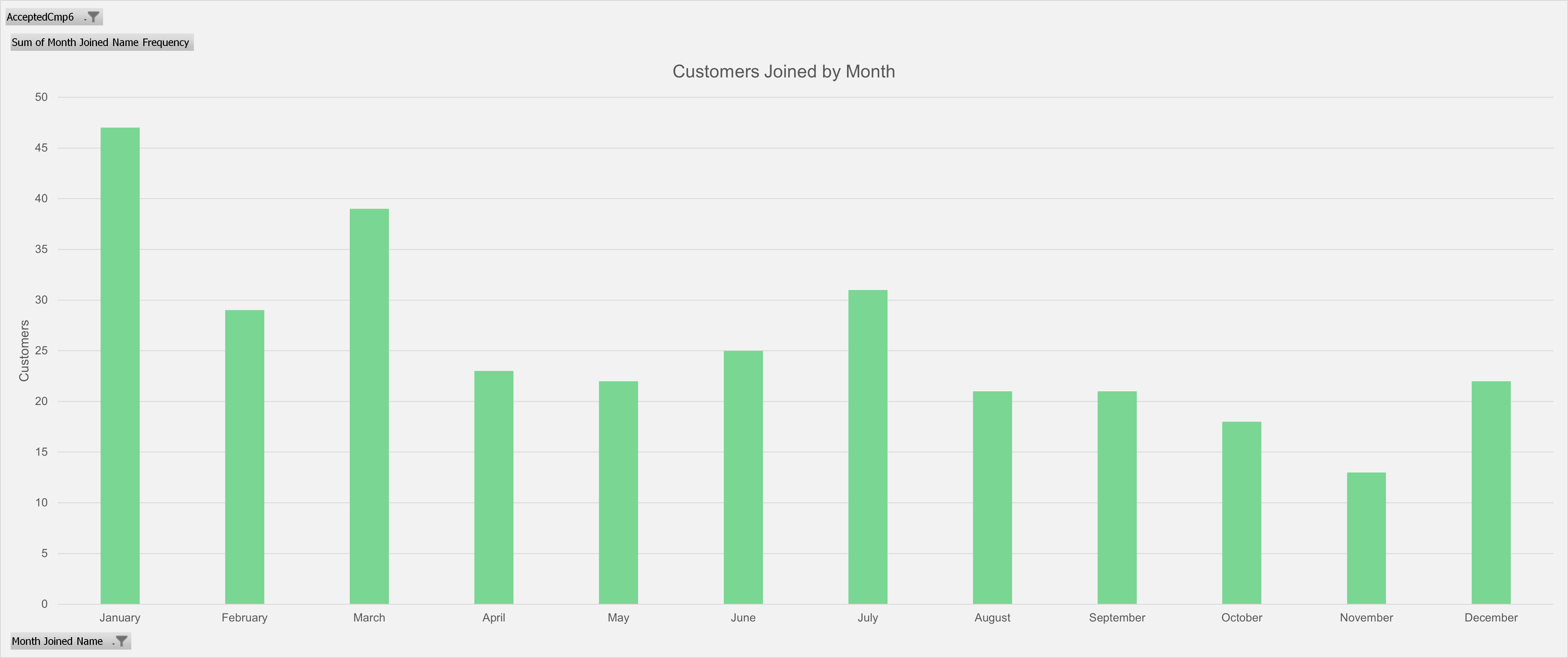
17) Next I wanted to see the effect of time on campaign 6. I added a couple columns to the data table to extract the month from the Date Joined column that customers joined DoorDash.
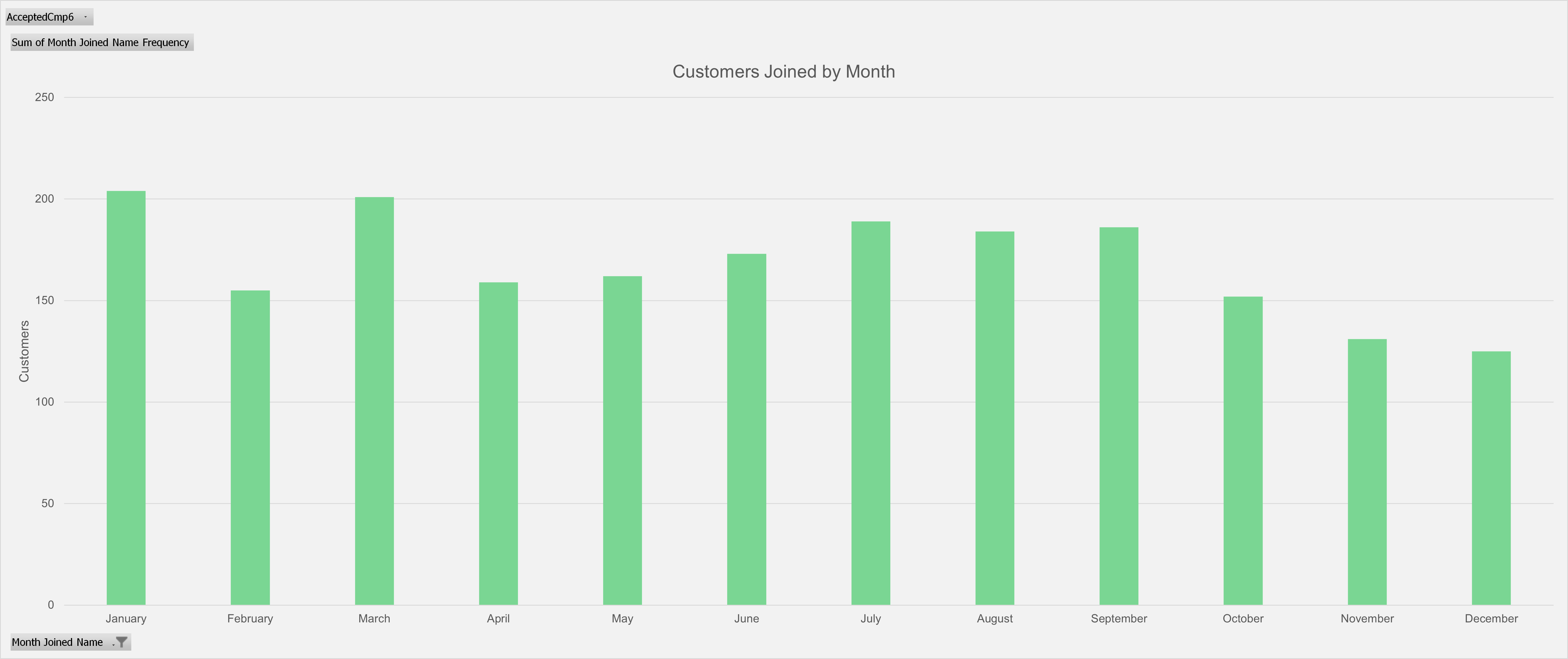
18) I made the Month Joined Name column and Month Joined Name Frequency column into another pivot table and created a pivot chart to show how many customers joined DoorDash during a particular month. You can see that the beginning of the year, particularly January, is a popular month for customers to join DoorDash.
19) The last thing I did for this analysis was create a VLOOKUP and XLOOKUP tool to find the customer income and the amount of money a customer spent on DoorDash orders when the Customer ID is provided. A tool like this could be useful if someone wanted a quick summary snapshot of one customer in the dataset.