Welcome to my NBA Tableau project! I wanted to analyze some data from the 2023-2024 NBA season for two reasons:
- To demonstrate proficiency across Tableau’s dynamic visualization types and advanced features.
- To hone core analytical skills by correcting data integrity issues and transforming raw data into simple, actionable insights into player value, team efficiency, and long-term roster sustainability.
The original dataset can be found here and addition basketball statistic descriptions can be found here.
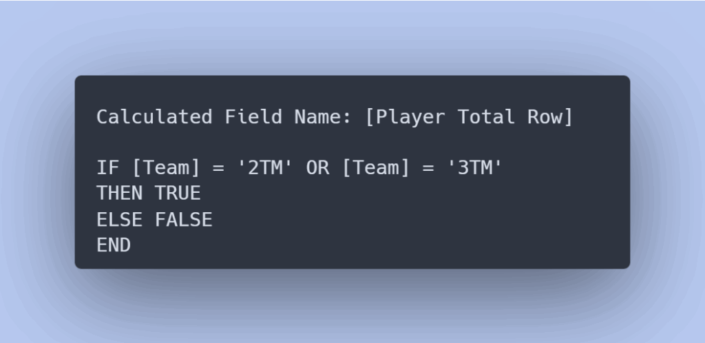
1) The first thing I did during this project was add a calculated field to use as a filter to deal with players that were on multiple teams for the 2023-2024 season. This would give me options for looking at players who played for the same team the whole season, players on 2 different teams for the season, and players on 3 different teams for the season.
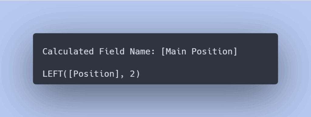
2) Since NBA players often play in multiple roles I created another calculated field to identify the position each player spent the most time in during games
3) First I wanted to create a general overview of player performance across the most important statistics: points, assists, and rebounds for the 2023-2024 season. This bubble chart visualizes Points and Assists on the X and Y axes, respectively. The size of each bubble represents the number of rebounds for the season, and the color shows the player’s Position. This visualization is designed to quickly identify outliers and reveal natural clusters, such as high-assist Guards or high-rebound, low-scoring Centers. Hovering over the data points will show the name of the player. As with the previous visualization, filters for Position and Team are visible on the right.
Filter Note:
- Null represents missing data from the NBA for the 2023-2024 season
- 2TM is data measuring stats from players who were on two different teams during the 2023-2024 season
- 3TM is data measuring stats from players who were on three different teams during the 2023-2024 season

4) My next visualization explores player value through playmaking, focusing on Assists. Assists are a critical statistic that demonstrates which players are most effective at distributing the ball and making the entire team better. I chose a Treemap for this analysis to effectively show proportion and hierarchy—the size of each player’s block is directly proportional to their total assists for the 2023-2024 season. The visualization is segmented by Position, allowing for an immediate comparison: which positions are the primary drivers of offense, and which individual players dominate the playmaking role across the league. This quickly identifies players who provide disproportionate value through ball distribution.
Filter Note:
- Null represents missing data from the NBA for the 2023-2024 season
- 2TM is data measuring stats from players who were on two different teams during the 2023-2024 season
- 3TM is data measuring stats from players who were on three different teams during the 2023-2024 season

5) Next I created a heatmap table to show the 3 point percentage of each team broken up by position. This heatmap table required calculating the true 3-Point Field Goal Percentage (3P FG%) for entire teams and positions, which introduced a classic data pitfall known as the Aggregation Trap. I learned that simply using the average of the existing 3P FG% column in the data would be misleading, as a simple average would give equal influence to a player with only one 3 point attempt as it does to a star player who took hundreds of 3 point attempts, resulting in a statistically unreliable and misleading group percentage. To ensure accuracy, I implemented this custom aggregate formula:
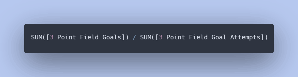
This approach correctly pools all 3 point goals and all 3 point attempts for the group first, calculating the single, volume-weighted percentage. By using this method, the heatmap visualization accurately represents the overall shooting performance for each team and position. By default I’ve filtered out the 3 Point percentage of Center players since their percentages are pretty low and long distance shooting is not really a good measurement of an effective Center.
Filter Note:
- Null represents missing data from the NBA for the 2023-2024 season
- 2TM is data measuring stats from players who were on two different teams during the 2023-2024 season
- 3TM is data measuring stats from players who were on three different teams during the 2023-2024 season

6) I was also interested in the long-term sustainability of each team. While it is inherently difficult to predict future outcomes based on past data, I believe this next visualization offers crucial insight into a team’s potential long-term value. This stacked bar chart shows the total number of points each team scored for the 2023-2024 season, with those points split by three distinct age groups. Teams whose younger players are contributing most of their total scoring could have a bright future and a stable development pipeline. Conversely, teams that are relying heavily on veteran scoring may face significant roster challenges and performance volatility as their core talent ages.
Filter Note:
- Null represents missing data from the NBA for the 2023-2024 season
- 2TM is data measuring stats from players who were on two different teams during the 2023-2024 season
- 3TM is data measuring stats from players who were on three different teams during the 2023-2024 season
